Brand strategy & design
Brand systems that make the price feel fair.
What it is
We work out what you sell, who it's for, and why anyone should pay your price. The identity comes off that answer. Then it gets written down properly, so the site, the deck and the invoice all look like the same company.
Best for
Companies whose work is better than the way it looks
Timeline
2 to 4 weeks
Price
Quoted per project
Why it matters
Design usually gets bought at the end, when the site is nearly due. So the logo gets picked in an afternoon and everything after it improvises. Six months later there are four versions of the mark, two blues that were meant to be one, and nobody in the company can say what it stands for in a single sentence.
That's what makes a price feel expensive, and it has very little to do with the number. A business that looks assembled reads as a risk, so buyers push back on it. When the whole thing looks considered, the same number stops being a question.
What you get
POSITIONING BEFORE PIXELS
We start on the commercial questions. Who you're for, what you're up against, what you want to be picked for. It comes back as one page you can hand to anyone who touches the brand after us.
THE IDENTITY
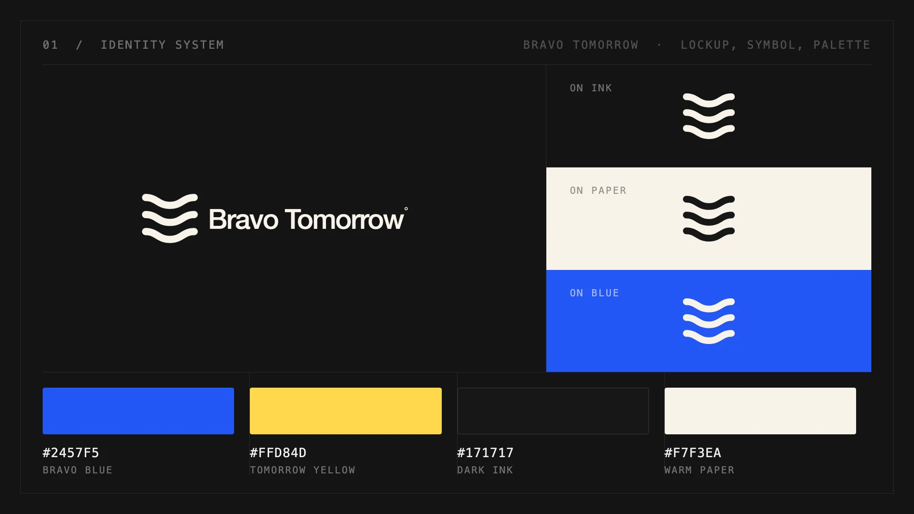
Wordmark, symbol, and the way the two sit together, drawn and tested at the sizes you actually use. A sign on a building and a 32-pixel favicon are different problems, and both get solved before we call it done.
TYPE AND COLOUR AS A SYSTEM
A type scale and a palette with rules behind them, built as tokens so the website, the deck and the next thing pull the same values. Change it in one place and it changes everywhere.
GUIDELINES SHORT ENOUGH TO USE
What to do, what not to do, and the files. Written so the next designer, printer or agency doesn't have to guess or email us to ask.
PUT ON SOMETHING REAL
Before handover we apply it to live surfaces. The site, the social profiles, the email signature, whichever document you send most. A brand that has only ever existed inside a PDF hasn't been tested yet.
How it runs
Discover
We ask the awkward questions first. What you sell, who else they're considering, and what the brand has to do for the business this year. If we're not the right studio for it, we say so here.
Build
Directions come back as real applied surfaces rather than logos on a white square, so you're judging the thing itself. You see it early and you stay in the loop the whole way.
Live
The system ships applied and written down, and when the next thing needs to look like the brand, you reach the person who built it.
Work like this
Common questions
How long does it take?
Two to four weeks for the identity and the system, depending on how much back and forth the positioning needs. If a website is part of it, that runs after.
Do you do naming?
Sometimes. It's a separate piece of work and we'll tell you up front whether it's worth doing, because a rename costs money in places people forget about, like signage, domains and every listing you're already in.
We already have a logo. Is it wasted?
Usually not. A lot of this work is keeping the mark you have and fixing everything around it, which is the type, the colour, the spacing and what the company actually says.